
My wife and I are starting to look at houses for sale in our area. There is a wonderful site called Zealty that shares an incredible amount of data, including sales prices, history, and assessed values. It’s invaluable for making an informed decision around what is typically the biggest purchase of your life.
We’ve been using the site for some time, and more regularly in recent weeks. During this time I’ve been able to gather some feedback and suggestions on what could make the experience even smoother. Here they are:
1. Allowing list search parameters to stick when refreshing the page.
Using the list search, if I refresh the page the search parameters are reset. This makes it difficult to come back and check for new listings during the day. I have to re-enter each time which can be frustrating. I also can’t bookmark/favourite a search because the URL doesn’t contain the parameters. Allowing this would allow me to save multiple different searches as bookmarks and load with a single click. Adding these two things would make list searching significantly smoother.
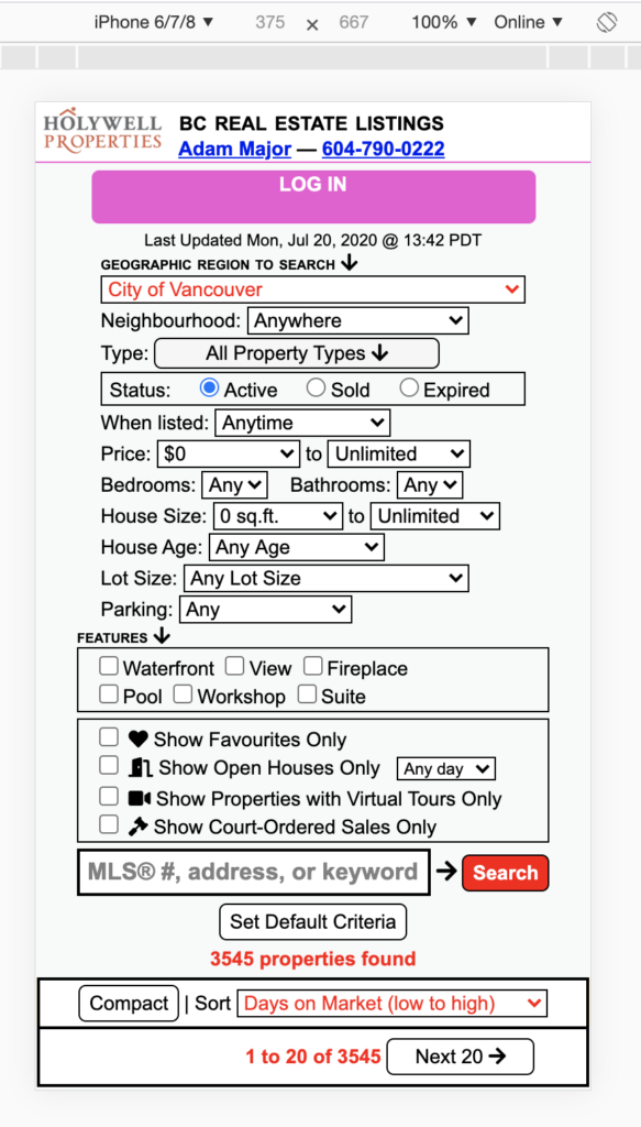
2. Collapse the search pane on smaller screens.
When browsing on my phone the search UI takes up a lot of space. It would be ideal to hide this by default, and have a button to expand and show it if I wanted to modify my search parameters.
3. Add a “Stream View” that shows properties listed on each day with a running total.
Our main use case for Zealty is to look at new properties that have come in each day. The site sends emails at the end of each day, but being able to check for new properties during the day would be ideal. Having an option in this view to break properties out by day listed, and a count total would help with this. So there could be day headings something like “Thursday, July 23 (10)”, and the ten properties listed that day underneath. You would see previous days and totals as you scroll.
We commonly want to quickly refer back to a property that came up very recently (in the last few days). This is not super easy without favouriting properties, and we don’t want to flood our favourites. Having a stream view would allow us to quickly refer back to previous days and find that property.
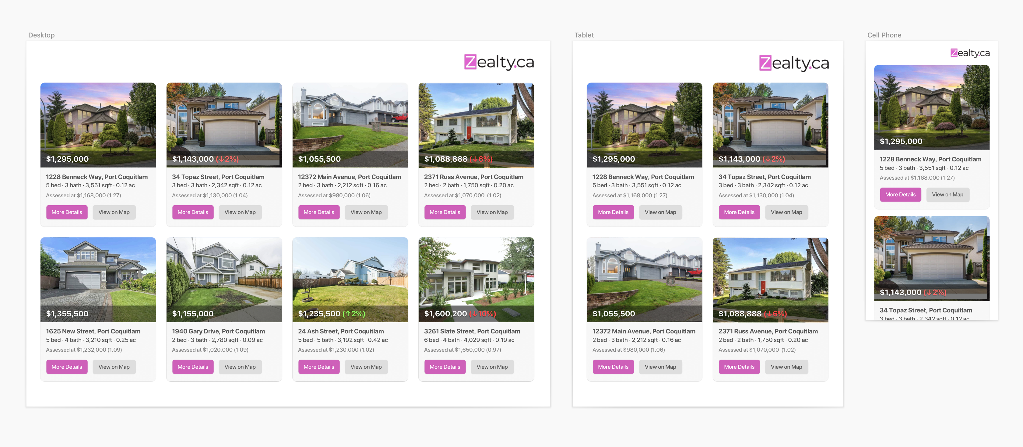
4. Make list view properties more scannable across device sizes.
I really love the list view because it offers a lot of control. However, across devices the sheer amount of information on each property makes it harder to scan across properties to find something that catches your eye. I spent a bit of time mocking up what a simplified property card might look like across device sizes, and how it would make scanning properties easier. If you want to know more about a property you can click through and get the full detail page:
5. Avoid opening new tabs on mobile devices.
When you select a property on the list or map view a new tab is opened. This can make it more cumbersome to go back to the map/list view when you’re clicking through a bunch of properties. If it stayed in the same window then you can swipe back to the previous view and continue. I realize for the list view it would need to handle point number 1 above to work like this. The map view works well already, taking you back to where you left off. Nice!
That’s all for now, as we use the site more I might have some more feedback. Thanks for the great site!